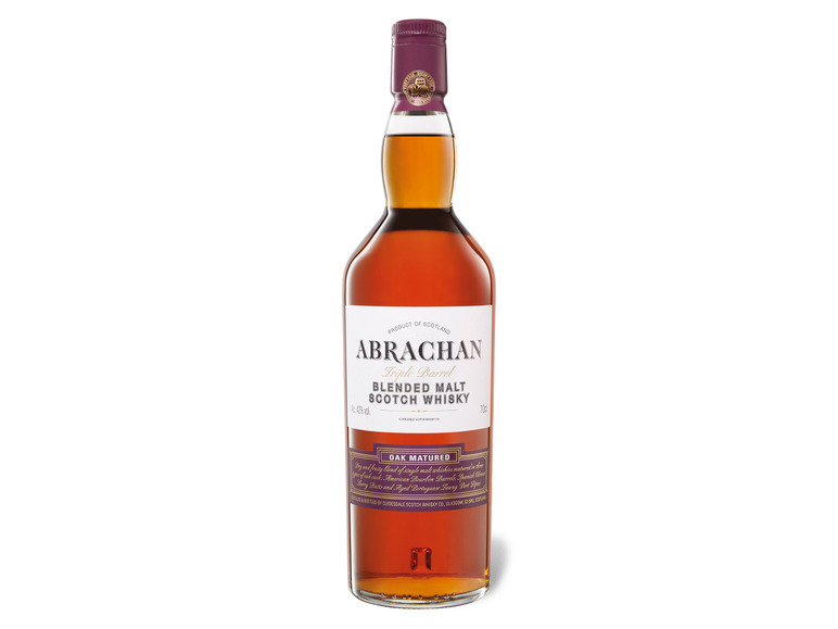
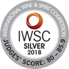
Dieser Blended Malt Scotch Whisky ist ein besonderer schottischer Whisky, der seinen einzigartigen Geschmack der Reifung in drei verschiedenen Fässern verdankt. Die Kombination aus einem jahrelangen Reifeprozess in amerikanischen Bourbon Fässern, in spanischen Oloroso Sherry Butts und in portugiesischen Port Pipes führt zu diesem außergewöhnlichen Geschmack mit einer harmonischen Balance von Karamell, getrocknetem Steinobst und Waldbeeren.
Gold Outstanding 93 and above: quality of the highest order
Gold 90-92: outstanding example, setting the standard
Silver outstanding 86-89: outstanding example, excellent quality
Silver 80-85: Fine example, excellent quality
Bronze 75-79: Good example, well above average
https://.iwsc.net/the-judging-process
Bewertungen (90)
IWSC - International Wine & Spirit Competition .flex_1_left,.flex_2_right,.hybris_custom_text_align_center,.width_30-_4er_reihe.text_align_center,.width_30.text_align_center,.width_full.padding_around_15px.text_align_center{text-align:center}.hybris_custom_container_1280{max-width:1280px;margin-right:auto;margin-bottom:1.5rem;margin-left:auto;padding-right:0;padding-left:0;font-size:1rem}.bild_flexbox_links,.rounded-corners{max-width:100%;border-radius:10px}.flex_1_left,.flex_2_left{padding-right:10px}.flex_1_right,.flex_2_right{padding-left:10px}.width_60{width:60%;margin-right:auto;margin-left:auto}.flex_1_left,.flex_1_right,.flex_2_left,.flex_2_right{width:50%;margin-top:auto;margin-bottom:auto}.height_24{height:2rem}.flexbox_custom_hybris{display:-webkit-box;display:-webkit-flex;display:-ms-flexbox;display:flex}.flexbox_custom_hybris.flex_justify_hybris_space_between{-webkit-box-pack:justify;-webkit-justify-content:space-between;-ms-flex-pack:justify;justify-content:space-between}.heading_h2_custom_hybris{margin-top:0;margin-bottom:1rem;font-size:1.75rem;line-height:30px}.heading_h3_custom_hybris{margin-top:0;margin-bottom:.5rem;font-size:1.5rem;line-height:1.2;font-weight:700}.width_full{margin-right:0;margin-bottom:30px;margin-left:0}.width_full.padding_around_15px{padding:15px}.width_30{width:30%}.w-embed:after,.w-embed:before{content:" ";display:.w-embed:after{clear:both}.w-video{width:100%;position:relative;padding:0}.w-video embed,.w-video iframe{position:absolute;top:0;left:0;width:100%;height:100%;border:none}.image_hybris_features{max-width:90%;margin-bottom:.75rem;border-radius:10px}.image_hybris_header_hochformat{width:25%;max-width:100%;border-radius:10px}.image_hybris_header_querformat{width:55%;max-width:100%;border-radius:10px}.bild_2er_flex{width:50%;margin-top:auto;margin-bottom:auto;padding:10px}.width_30-_4er_reihe{width:30%;padding:10px}.image_hybris_4er-features{max-width:100%;margin-bottom:.75rem;border-radius:10px}.width_45{width:100%}.width_10{width:10%}@media screen and (min-width:1280px){.hybris_custom_container_1280{font-size:1.125rem}.heading_h2_custom_hybris{font-size:1.875rem;line-height:1.2;font-weight:700}.heading_h3_custom_hybris{font-size:1.625rem}}@media screen and (max-width:991px){.hybris_custom_container_1280{max-width:1280px}.width_60,.width_full{width:70%}.flexbox_custom_hybris.flex_justify_hybris_space_between..flex_1_left,.flex_1_right{width:50%}.image_hybris_header_hochformat{width:30%}.image_hybris_header_querformat{width:65%}.bild_2er_flex{width:60%}.width_30-_4er_reihe{width:45%}}@media screen and (max-width:767px){.centered,.flex_1_left{text-align:center}.width_60{width:80%}.height_24{height:2rem}.flexbox_custom_hybris{-webkit-box-orient:vertical;-webkit-box-direction:normal;-webkit-flex-direction:column;-ms-flex-direction:column;flex-direction:column}.flex_1_left{width:100%;padding-right:0}.flex_1_right{width:100%;padding-left:0}.flex_2_left{width:100%;padding-right:0}.flex_2_right{width:100%;padding-left:0;-webkit-box-ordinal-group:0;-webkit-order:-1;-ms-flex-order:-1;order:-1}.bild_2er_flex,.width_full{width:100%}.width_full.padding_around_15px{padding-right:0;padding-left:0}.width_30,.width_30-_4er_reihe{width:100%;margin-bottom:30px}.icon_hybris_feature,.image_hybris_4er-features,.image_hybris_features{max-width:100%}.image_hybris_header_hochformat{width:40%}.image_hybris_header_querformat{width:75%}.width_45{margin-bottom:30px}}@media screen and (max-width:479px){.bild_flexbox_links,.width_60{width:100%}.height_24{height:1rem}.flex_1_left{padding-right:0}.width_30,.width_30-_4er_reihe{margin-bottom:40px}.image_hybris_header_hochformat{width:55%}.image_hybris_header_querformat{width:95%}}